for the love of type
book design | adobe indesign + illustrator | 2023
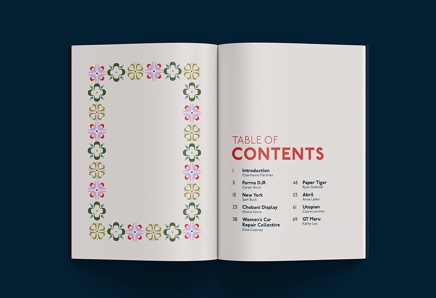
For the Love of Type is a collaborative book project where each designer chose a font and created spreads that analyzed their history and design. These spreads were then compiled into a book. This is a two-part project featuring the design of the font analysis as well as the overall book.
font analysis spreads
ideation
I chose the font Women's Car Repair Collective, designed by Nat Pyper as part of their Queer Year of Love Letters series. The font references the hand drawn type on a poster created by the Lesbian Alliance of St. Louis from the '70s and also draws upon Moonstorm, a lesbian-feminist magazine from the time. In my project, I wanted to draw upon these same rebellious, DIY aesthetics.


digital exploration
Moving into digital exploration, I featured images of the Moonstorm magazines to give context to the font. I experimented with ways to emulate the handmade quality of the magazines and flyer in my design. I also decided on using lavender as a symbol of queer history.


final spreads


For the final spreads, I created hand drawn elements like borders and underlines to emulate the handmade aesthetic of the font and its history. I focused on highlighting specific parts of the letterforms in the analysis and making the organization of the spreads more structured as well.
book design
ideation
I initially designed the book with a focus on the geometry of type and used letters as a sort of pattern. My goal was to create something that would formally combine well with the content of the book.


I then switched directions and became interested in playing into the name "For the Love of Type" by creating a book that looked romantic and similar to a love letter. I explored calligraphy and ornamentation inspired by illuminated manuscripts. I thought the calligraphy was a fitting motif as a nod to some of the origins of western typography.


digital exploration


Incorporating my hand-drawn calligraphy, I experimented with different ways to create the "love letter effect" I was looking for. After creating various cover designs, I decided that a pattern comprised of calligraphic strokes was the most pertinent for a book about typography.